Next: Responsive Email Templates

If you regularly read your email using an Internet-enabled smartphone or tablet, you probably know that it’s an experience that can swing from awesome to awful. While an email newsletter can look superb in your desktop inbox, when squeezed onto a small screen, it can become absolutely unusable, with small fonts, narrow columns and broken layouts.

We recently decided to rebuild one client’s email blasts from scratch so that the mobile version would be as attractive and easy to navigate as the desktop version. What finally convinced the client — and us — to move forward were the email client-software reports his list generated. We realized that mobile readers make up probably close to 40% of our client’s database. So having a solid mobile version of the e-blast is essential.
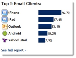
OM3 Client Report Example
Finding a way to deliver an email that renders well in all screen sizes is a challenge. Currently, most marketers can either create a separate email for mobile users and deliver it based on subscriber preferences or provide a link in their email to open a mobile-friendly version in the device’s web browser. The current trend is to move from an email that is designed only for the desktop to a simplified single-column design that can be optimized for all desktops.
RESPONSIVE DESIGN
By taking advantage of some new coding techniques, we can now deliver both desktop and mobile-friendly versions, all-in-one, automatically optimized for whichever device the email is viewed on. It is called responsive design and it is already being used in many websites today.
Email marketers, however, are just beginning to take advantage of this technique, and it is changing the way we design our emails for improved rendering across different devices.
Keep in mind, this is only a change to the way we code and design our emails and can be applied using your current ESP’s tool set.
EMAIL RENDERING ON MOBILE DEVICES
Before we get into our example, let’s take a look at how important a properly rendered email on a mobile device has become according to a recent ESP survey:
- 77% own a mobile device enabled to receive email.
- 68% use their mobile device to sort through emails before they read them.
- 45% never click on the “view this email online” from a mobile device.
- 70% delete an email if it doesn’t look good on their mobile device.
- 75% have negative perception of a brand from a poorly designed email.
These numbers show how many people are using their devices to read and sort their emails, that they are quick to delete poorly rendered ones, and that they perceive brands negatively based on bad design. Marketers can no longer afford to dismiss the need to send mobile-friendly campaigns.
You are not asking your team to create two distinct templates, instead by using CSS code, you can decide what to omit from the mobile version. This takes some planning, creativity, and plenty of testing, but it works. Bottom line: one template can produce two distinct versions with the right media query.
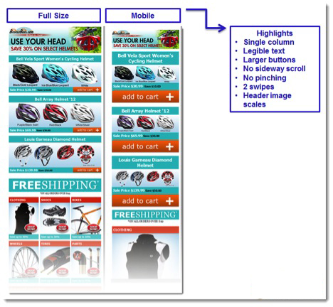
For example, we applied the above technique for the BicyleBuys.com e-blast template and you can see the difference between the resulting renderings in the illustration below. The mobile version features:
- a single column design
- more legible text
- big call-to-action buttons
- no sideway scroll
- no pinching and 2 or 3 swipes is all it takes to view the entire campaign
RESPONSIVE EMAIL TEMPLATES
The shift to mobile is happening at an extraordinary pace and thanks to evolution of the responsive template emails can now reach across multiple devices and provide a great experience on any screen.
Keep in mind that if you use the OM3 platform you can use one our pre-built free responsive templates from our library. So you don’t need to a Ph.D. in HTML to create one. Give us a call for a test drive and go mobile.


