Mobile Email is the NEW Social

The Email Design Conference 2013 (TEDC13) conference farewell
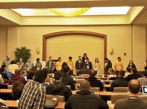
I’m a certified email geek but apparently I’m not alone. At the first annual Email Design Conference (TEDC13), Litmus invited the London, San Francisco and Boston Metro communities in three separate events to share successes, discuss obstacles and even get a little jiggy. I personally witnessed a lot of enthusiasm, motivated by the conference moderator, Justine Jordan, for two days at Boston’s Seaport World Trade Center where a room full of previously enigmatic email designers were educated, entertained, redeemed and validated.
Hear-ye, hear-ye
The digital service known as mobile email marketing has taken an official seat in the big-boy boardroom: personable, shareable and timely, mobile email provides a multichannel experience without limitation. The conferences talented speakers likened the email marketing mobile horizon to a renaissance mindset. Reborn, refreshed and at everyone’s fingertips, said Action Rocket’s Elliot Ross, “Someone had a good idea, and it wasn’t a suit!”
Email opens on mobile devices have increased 350% since 2011
Metric Take-aways
Some interesting statistics took center stage, portraying the gravity of the mobile email channel.
- 3% reopen emails on another email client while a whopping 97% view the email in a single environment.
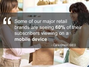
- Email opens on mobile devices have increased 350% since 2011, occupying a 45% of share of the market.
- Only 13.5% of those surveyed said they reviewed a mobile email that didn’t look quite so good for a second time on their desktop devices. 68% said that they unsubscribed right then and there and 15% said they deleted it. Poof… gone!
Win/Win Design Tips
Employ more contrasting colors for a better mobile experience in all sorts of lighting.
- Clean layout and concise content guarantees a great mobile look and delivers a focused call-to-action.
- 1-column optimized layouts are easier to resize in responsive frameworks.
- Big “bullet-proof” buttons (at least 44 pixels square) within enough white space gives readers plenty of room to tap through to landing pages.
- Use of contrasting colors supports a mobile experience in all sorts of lighting environments.
Last but hardly least are the traditional standards:
- Always describe your images in alt and title tags
- Boost subject line engagement with a complementary preheader
- Balance text and image content to encourage inbox deliverability
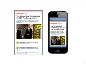
Clean layout & concise content.
1-column optimized layouts are easier to resize.
The Future is Bright
It is a brave new mobile email world and in the next five years email technology in both the B2B and B2C sectors will seamlessly integrate customer purchasing transactions, incorporate personalization and open-to-click behaviors, deliver real time content based upon dynamics and ultimately create stronger relationships in a customer-centric world.
When all was said and done, this close-knit conference agenda offered lots of sessions on a variety of topics: statistics and trends, design and content tips, ground-breaking mobile technology, case studies and a chance to network with a growing group of career-minded email professionals. And while it is true that all things must come to an end, this bittersweet journey continues. So long after this year’s TEDC13 comes to a close, reference these great resources… and see you at TEDC14?
Related Posts
Books
- Email Marketing Rules, by Chad White
- The Elements of Content Strategy, by Erin Kissane
- Modern HTML Email, by Jason Rodriguez


