Designing for Mobile…

 Many times when designing an email, we overlook the bare necessities, like ‘Can my customer see what I’m seeing?’. Mobile optimization is one of those fuzzy areas of email design: some brands will nail it as a priority, while others haven’t even got it on their radar. Here’s why it matters:
47% of email is opened on a mobile device,
while mobile overall represents 58.9% of digital sales. Get to grips with just how many of your contacts open, click and convert on mobile devices. Within OpenMoves reporting, you can access a detailed breakdown of what devices are used to open every campaign you send. Find out the percentage of iPhone opens, for example, or build a more accurate picture of how many tablet engagers you’ve got on the books. Below are some things to look out for when designing an email for mobile.
Click to learn about Mobile Display Settings and options available in OM3!
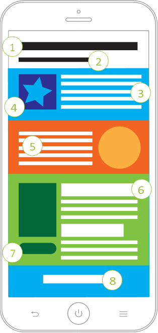
The anatomy of a responsive mobile email
 With mobile set to dominate the market share moving forward, consider optimizing your digital marketing messages to hit the smartphone sweet spot. Here’s a handy list of 10 mobile best practices to help your brand stand out in any inbox:
- Keep your subject lines short and simple. Use fewer than 50 characters.
- Use the preheader text to deliver a more impactful message. This can be the difference between someone opening or deleting your message.
- Try to design emails using single column layouts. Emails no wider than 620px and a minimum of 320px are best.
- Resize your images to fit on a mobile screen. Use CSS to adjust the width of the template and content; text within images should be considered in the smaller form factor.
- Apple’s recommendations for finger touch area is 44px x 44px. CTA buttons should be anything over this size.
- Keep in mind the font size and copy length – no one wants to read an essay in tiny type. The recommended minimum font size for all main content on mobile is 16px.
- Use a clearly demarcated CTA and ensure it can be seen when the email’s opened.
- Keep the header clean. If navigation is necessary, keep it minimal and choose your key words.
- Remember, always test your templates and measure the performance to help you optimize and fine-tune your campaigns.
- Don’t forget your landing pages! There’s nothing more frustrating for a potential customer than clicking through to an unresponsive or unattractive/messy website!
Click here for more tips and message design recommendations.
