How Mobile Are Your Emails?
If your prospects and clients are reading your email using a smartphone or tablet, it’s likely their experience can vary anywhere from awesome to awful.
An email newsletter that looks superb in a desktop inbox can sometimes become absolutely unusable when squeezed onto a small screen where fonts shrink, columns become narrower, and layouts break, all possibly resulting in fewer engagements and conversions — and less business.
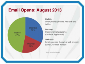
According to a recent study by Litmus — which does email testing and analytics — today nearly 50% of all email opens are on a mobile device, while only 32% are on a desktop (using an installed email program like Outlook), and 21% use webmail through a browser (like Gmail, Hotmail, or Yahoo!).

Email Opens August 2013
How do your prospects and customers read your email? No, don’t guess or go with your gut. The reports you receive from your email provider ought to be able to easily show you the stats. If more than 20% of your readers are using mobile to read your email, it may be time to re-think your design strategy.
Justine Jordan, marketing director at Litmus, recommends that, regardless how people are reading your email, the most savvy move you can make is to invest in optimizing them for mobile — or what is known as a “mobile first” design. It will improve the look of both your emails that are read on a mobile device and on a desktop.
Here are two ways to do it:
#1. Consider “mobile first” which is a collection of design and content strategies that put the needs of the mobile user above all others. Basic principles include:
- Use single-column design. Industry standard is 600 pixels wide but can be skinnier (from 320-500 pixels) because mobile screens are narrow.
- Use large text and buttons (44 pixels square at a minimum).
- Use generous white space (at least 10 pixels of space between clickable elements).
- Use clear calls to action (CTAs).
- Use short, concise body copy.
- Use finger-friendly design. Don’t forget that mobile readers most often use their fat fingers — not a mouse cursor — to “click” on a touch screen.
Most importantly, remember that a mobile-first design depends on more than just a layout change. You’re not trying to take all your usual lengthy content and shoehorn it into a long, one-column design. If your emails start to look like huge paper rolls, you need to rethink and shorten up on your content.
PROS: A mobile-first design prioritizes important data, content, and CTAs. It’s easy to build and does not rely on media query support. And it renders well in most email clients and apps.
CONS: The desktop experience can suffer, it offers less real estate, and it can get long.
Mobile first is best if you need to change, want to test the waters, and are strapped for resources.
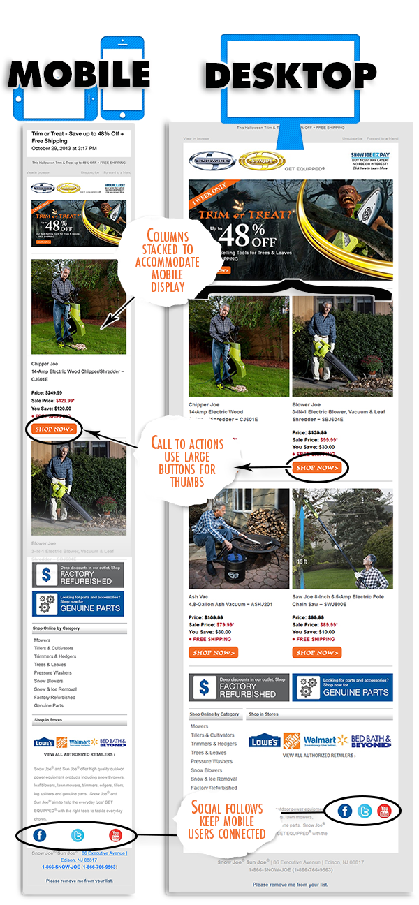
Snow Joe’s (below) provides their customers with a sleek smartphone inbox experience:
• Thoughtful strategy stacks the columns and accommodates a smaller mobile display
• Calls to Action incorporate large buttons for thumbs, well-placed for comfort
• Social follows keep mobile users connected

#2. Consider a “responsive design” which is a collection of techniques that adapt the content depending on the email screen size and platform. In other words, on a narrow mobile screen, the email may employ a one-column layout with larger text while, on a wider desktop screen, the reader may see two columns of text plus an additional image. Responsive design allows you to send almost a completely different email to mobile readers compared to desktop readers; it just takes additional time and effort (and possibly a bigger investment) to create the appropriate coding.
Remember that your content should still employ mobile-first best practices. Also, note that Android Gmail doesn’t support the media queries required for a responsive design. If you have a large number of Android readers, you’ll want to avoid this technique.
PROS: Responsive design restyles, resizes, and/or reorders elements based on the email client. It has the ability to hide/show desktop- or mobile-specific images or content. And it customizes CTAs and offers a seamless experience across a range of screen sizes.
CONS: A substantial coding learning curve can force tough decisions and increase production and QA time.
ONE LAST TIP: If your email’s CTAs take your readers to a web page, you need to be certain you don’t lose that conversion when they reach the next step. For instance, if your web page uses flash and most of your users use iPhones — which don’t support flash — they will never be able to sign up for your webinar or buy whatever you’re selling.
Be sure your landing page is finger-friendly and, if it contains an e-commerce experience, optimize it so it can be accessed from mobile.
Does that mean creating a special mobile-specific landing page? Or does it mean that you need a “responsive” web site that knows when someone is coming from an email and adjusts accordingly? Whichever you choose, be certain you’re not losing customers because they came from mobile and your web page isn’t mobile-friendly.
And, once again, when designing that landing page, employ those same best practices — meaning mobile first!
The bottom line is you’ve got three choices. Pick one: (1) Do nothing if you feel that your community is not going mobile (which is highly unlikely); (2) Employ mobile-first design principles that will force you into excellent usability choices and ensure that your emails will shine no matter where you point them, or (3) If you feel that your demographics are highly mobile (as in retail, travel, and technology) and you have the resources and time to learn responsive design, that may be the way to go.
If you need a help with your email mobile strategy contact us.


