Dark Mode for Email: What You and Your Designers Need to Know
What is dark mode for email? In dark mode, an email program takes an email designed with a light background and dark text and inverts it to a dark background with light text.
Who is using dark mode? Multiple surveys show that 80-90% of respondents are using dark mode in one form or another. So, with most major email clients offering dark mode, it just makes sense to design with dark mode in mind.
Why are people using dark mode? There are a couple of reasons to use dark mode. I use dark mode to avoid eye strain and headaches. I find light text on a dark background to be easier on my eyes but others say that dark mode can make your eyes work harder by forcing the eye to open wider to absorb more light. There is also a group that claims that contrast is most important when trying to avoid eyestrain. Some Say that dark mode successfully reduces blue light and can cut down on glare.
The reality is that dark mode is largely a matter of personal preference: It works for some people and doesn’t for others.
Some claim that dark mode can save battery life. Whether this is true or not depends on your screen. If you have an OLED (organic light-emitting diode) screen, dark mode can increase your battery life by up to 25% depending on the app you’re using. If your device uses an LCD screen dark mode won’t help with battery life – but turning down your screen’s brightness will.
Dark mode is here to stay. To make sure your customers are getting the best email experience possible, embrace making your emails as friendly as possible for both light and dark mode
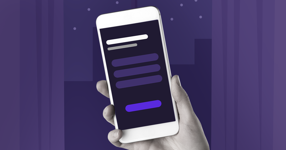
When to design for dark mode? You should think about dark mode every time you sit down to design an email. Plain text emails look great in dark mode. The white background becomes black and the black text becomes white. Simple! Dark mode only gets complicated when you have a beautifully designed email using logos, images, and maybe even different colored text.
How to design for dark mode? To make your email as bulletproof as possible there are a few tips for designers.
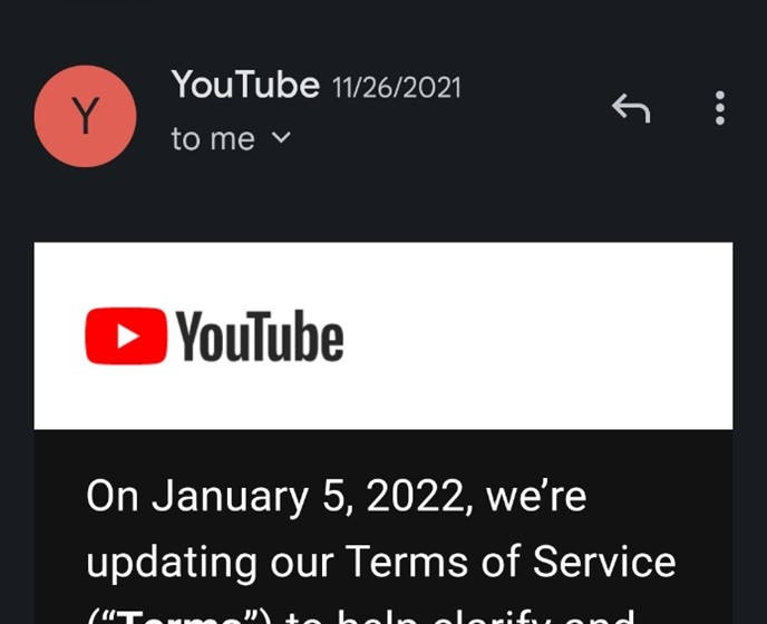
1. Create logos with dark mode in mind.
One option is to follow YouTube’s lead and put your logo on a full-width banner so it doesn’t need any modification and always feels definitively a design choice.
You can also take your dark logo, make it a transparent png and use a stroke around the logo that matches the background color in light mode but helps the logo stand out in dark mode.

White Background/White Stroke 
Black Background/White Stroke
2. Use transparent images when possible. Try to avoid using images that match the background color in the HTML and instead use transparent PNGs.

Transparent png on white background 
Transparent png on black background
3. Add a vignette or dim filter to any bright images.
4. Using HTML and CSS as much as possible to code dividers and separators will allow them to also switch colors to stay consistent with the design.
5. Remember to test your emails in both standard and dark modes.
Dark mode is here to stay. To make sure your customers are getting the best email experience possible it’s important to embrace making your emails as friendly for light & dark mode as possible.