TVEyes Case Study – Is My Email Too Long?

Most marketers’ number one concern when they are thinking about too much content is whether or not their readers will see the most important content, including the content at the very bottom. With mobile readers now accounting for 53% of opens, according to Litmus, many email marketing rules are changing, including the best length of an email campaign. Trying to determine if your email campaign is too long requires some investigating. And, the right length for your company’s emails may not be the right length for another company’s.
First, avoid getting truncated.
Some email clients, particularly Gmail, will truncate a message after 102kb. This means the message gets cut short and readers have to click on a link to view the full message. Another downside of this is the unsubscribe link, usually at the bottom of an email campaign, gets hidden if the message is truncated. This could lead to an increase in spam complaints when readers can’t easily unsubscribe. If working with a design file, it’s best to keep the length of an email under 1500px long. ESPs can also show you how big your email is; OpenMoves shows this information on each campaign’s summary page.
What’s the right length for your email?
The type of email campaign (a B2B newsletter vs a B2C promotional email) and the frequency of your email messages certainly effect how much content is in a campaign, but you’re not going to know what works best for you until you begin testing. And before you begin testing, you need to understand your goals and how your goals affect your content.
Including multiple calls to action and links in your emails, in most cases, results in more clicks. And marketers like to see lots of clicks, right? Well, it depends on your goals. If your goal is to pull people into your website because you’re confident that your site does an excellent job with conversions or you just want to increase web traffic, then feel free to include different links pointing people to your site. Just be careful. More calls to action & links usually lead to a longer, and possibly, more diluted message. I’ve seen B2C emails where the marketing team was adamant that all emails include a left-navigation because without it, the total clicks were much lower. The left-navigation made the email very long and also too wide. Until their mobile readership increased to more than half of all opens, they were reluctant to give up the left-navigation. The left-navigation didn’t render well on mobile devices and worked against their goal of getting a high number of total clicks.
However, if your goal is something more specific like asking a recipient to email you or download a whitepaper, including lots of different links may work against you. Yes, you may have lots of clicks if you include more links, but you didn’t accomplish your goal of getting your whitepaper out in front of your email list. Focused and streamlined content will make your email message shorter, and hopefully, more effective.
Once your goals are settled, do an A/B test with a streamlined version and a full version. Remember to keep the subject line the same on both emails. Review the campaign’s report about 24 hours after send time and then again 5 days later for more robust behavioral data. When assessing the success of a campaign, evaluate it within the parameters of your goals. Also look at what percentage of your readership viewed the email on a mobile device and how the content was presented to those readers.
The TVEyes Case Study
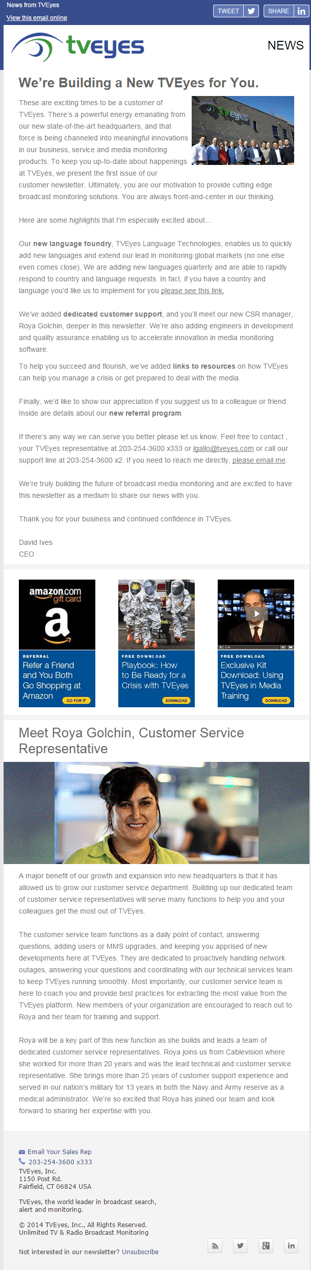
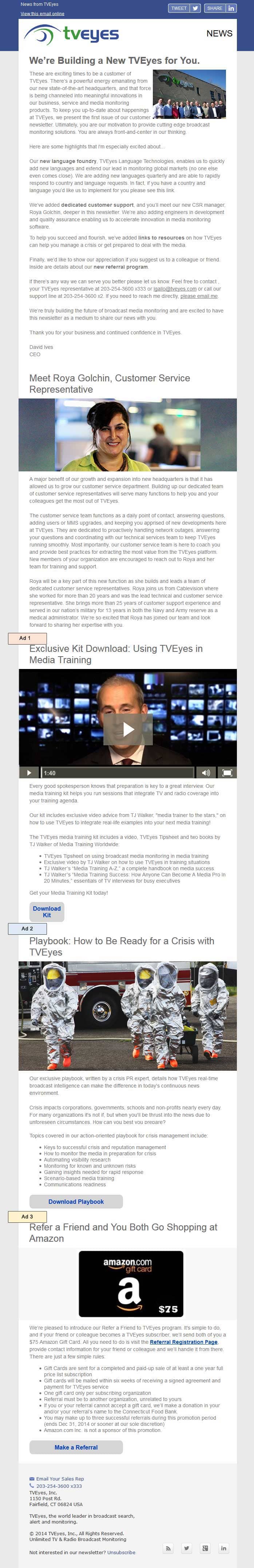
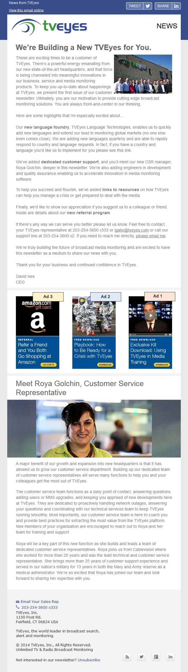
TVEyes, a broadcast media monitoring company, issued its first newsletter last year with the help of AustinLawrence, a company offering B2B Marketing Services. They wanted to include three separate offers, each with their own hero image, copy, and call to action. This made the email seem quite long. To determine if the email would do better as a shorter version with the offers side-by-side in a single row as separate ads, they decided to do an A/B test. To assess the campaign, they compared total clicks for the three offers.
You can see from this chart that in the long version (B) , clicks are decreasing as the ads are placed further down the email. The most obvious difference is how Ad3 performed in the short version (A) compared to the long version – 13 clicks vs 1. The total size of the long version was app. 66kb, so it shouldn’t have gotten truncated. Either way, it’s apparent that readers didn’t make it to the end of the long version to see this the third ad.

Going forward, TVEyes stuck to running the three offers as ads across (Version A) and not in their own content sections, which made the email lengthy.
In summary, testing is the best way to determine how much copy is too much copy for your readers and for each type of campaign. To determine the best length for your emails, first set your goals as this will impact the layout of your content, and then do A/B testing with different length emails. Try to keep all emails under 1500px and 102kb so they do not get truncated in email clients like Gmail and Yahoo.


