Click Here! 7 Tips for Call-to-Action Conversions

If you can understand what makes someone click the call-to-action (CTA) in your email, web site or landing page, you can boost the chances of getting your CTA clicked. And at the end of the day, clicks — and ultimately conversions — define online marketing success.
So how can we create effective CTA messaging that grabs your users’ attention and entices them to click? Let’s take a look at some examples.
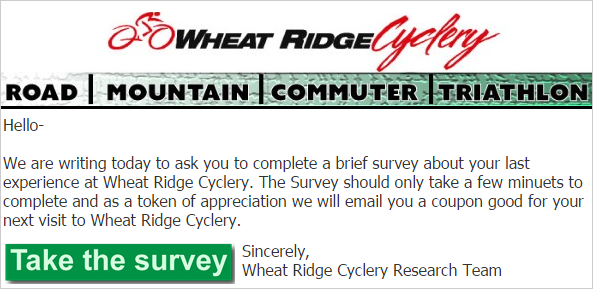
#1 – Size matters
In web and email designs, the size of an element relative to its surroundings indicates its importance: the larger the element, the more important it is. Size your call-to-action buttons accordingly. In the example below, to grab attention the call-to-action message is bold and stands out.

#2- Top position matters
The placement of call-to-action message is critical to drawing the eyes of visitors. Placing the CTA in prominent locations such as the top section of a web page or email template will convert better because users start reading at the top and may never make it to the bottom of the page. Get them while they are starting to scan.
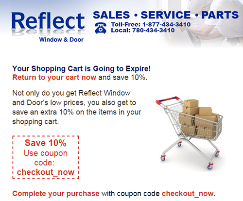
#3 – Location, location, location
Putting a call-to-action message next to an important area of your page or blast makes it stand out. You can see this idea in action on the web site below where the CTA button is at the top of the email and highlighted with a savings incentive.
#4 – Use highly contrasting colors
Deciding what colors to use for call-to-action buttons is critical. Your message should have a high contrast relative to adjacent elements and the background to stand out. Purity’s email blast below exemplifies how color contrast between a CTA button and its surroundings can draw attention: the background is grey and the call-to-action button is a bright orange. It begs for attention.

#5 – Create flow between primary and secondary CTAs
Below is an example of two call-to-action buttons side-by-side. By differentiating the images, users can see that they have two distinct routes: they can either call (primary action), or download to learn more before committing. This effect creates flow and encourages action.
#6 – Tell users that taking action is easy
Often, a user’s hesitation to take action stems from fearing that an action will be difficult, costly, or time consuming. By alleviating these concerns, your call-to-action message can lead to more conversions.
For example, the CTA button below defines the time it would take users to sign up and that signing up is free. This approach addresses a primary concern when taking action online: paying, which requires a credit card and additional time.

#7 – Tell users what to expect
Most people are hesitant to take things they see on the web at face value. Their trust has been burnt by links that promise free service only to find out that they’d have to put in their credit card number to get what they want.
For example, to increase trust, Mozilla Firefox tells users exactly what to expect when clicking on their CTA button. The copy tells you that you’ll be getting Firefox 3.5, that it’s free, and that the exact version is 3.5.3 for the Windows operating system, that the language is English, and that you should expect a 7.7MB download. No guess work required.

In short, when designing CTA buttons for your web pages and email blasts keep the following in mind and your conversions will soar:
- Size matters – big means important. Make buttons larger.
- Prime Location – If it’s important content, place the CTA nearby.
- Contrast – contrasting colors will make your CTA stand out. Be bold.
- Flow – several related CTA buttons move the prospect to action.
- Informative – take away hurdles by providing information on the CTA.
If you need any help with conversion strategy or execution -> click here!
Are you looking for a few more tips on creating great emails? Read the following blogs:
Your 2015 Email Marketing Checklist